- More enquiries since launch
- +30%
The starting point
A photography studio in Albufeira with seven distinct session types — solo, family, maternity, engagement, elopement, proposal, renewal of vows. Every visitor arrives with exactly one of them in mind and no interest in the other six. The task was one site that speaks to all seven without collapsing into a menu.
The approach
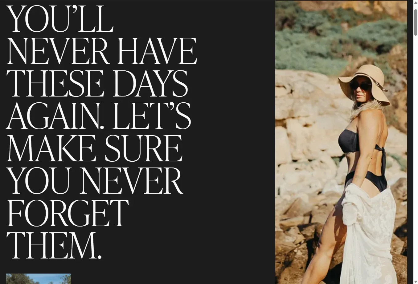
A full rebrand and an editorial site built around the moment rather than the service list. Dark cinematics carry the photography; a bold serif holds the voice. The work splits into the seven session types, so a visitor lands inside their own scenario instead of scrolling past six that are not theirs. The promise — 50+ images, delivery within 72 hours — sits where the decision gets made, not buried on a rates page.
In detail
-
Seven doors, one brand
The portfolio splits by session type, so every visitor sees their own moment first while the brand stays one thing throughout.
-
Dark cinematics, serif voice
Photography carries the page against a dark field; a bold serif does the talking. Nothing competes with the image.
-
The promise up front
50+ images and a 72-hour turnaround are stated where people decide, rather than left as a question they have to ask by e-mail.
The outcome
Since the new site went live, enquiries are up by roughly 30% compared to before.
What we did
- Web design
- Brand identity
- SEO